Lab 1E: What’s the Relationship?
Lab 1E - What's the Relationship?
Directions: Follow along with the slides, completing the questions in blue on your computer, and answering the questions in red in your journal.
Finding patterns in data.
-
To discover (really) interesting observations or relationships in data, we need to find them!
– Which is difficult if we only look at the raw data.
-
The best tool for finding patterns is often ... your own eyes.
– Plots are an excellent way to help your eye search for patterns.
-
In this lab, we'll learn how to include more variables in our plots to make them more informative.
-
Import the data from your class' Food Habits campaign and name it
food.
Where's the variables?
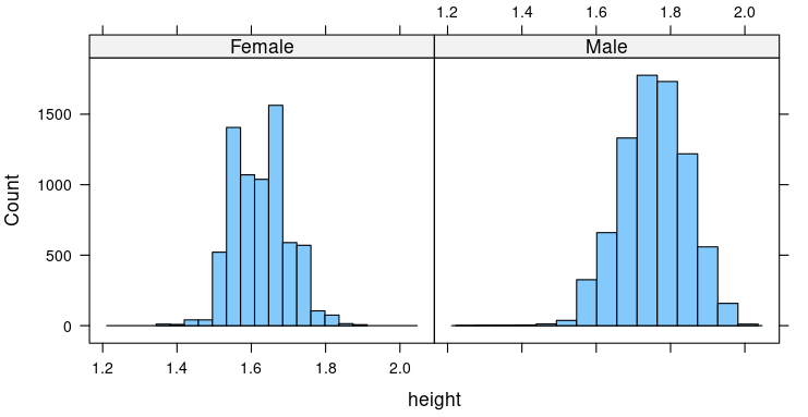
- How many variables were used to create this plot? Which variables were used and how were they used?
Multiple variable plots
-
The previous graph is an example of a multiple variable plot, which means that more than a single variable was used. In this case:
-
Variable 1: height
-
Variable 2: sex
-
Multiple variable plots are tools for finding relationships between data.
-
Let's take our
fooddata and make some new multiple variable plots you haven't created before!
Scatterplots
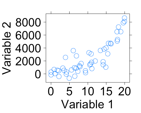
- Scatterplots are useful for viewing how one numerical variable relates to another numerical variable.
Creating scatterplots
- Fill in the blanks to create a scatterplot with
sodiumon the y-axis andsugaron the x-axis.xyplot(____ ~ ____, data = food)
Scatterplots in action
-
Use a scatterplot to answer the following questions:
– Do snacks that have more
proteinalso have morecalories? Why do you think that?– What happens if you swap the
proteinandcaloriesvariables in your code? Does the relationship between the variables change?– Does the relationship between
proteinandcalorieschange when the snack is eitherSaltyorSweet? Write down the code you used to answer this question.
4-variable scatterplots
-
When we make scatterplots, we can include:
– 1 numerical variable on the x-axis
– 1 numerical variable on the y-axis
– Use 1 categorical variable to facet our scatterplot
– Change the color of the points based on another categorical variable
-
To change the color of our points, we can include the
groupsargument much like we did for bargraphs (use the search feature in the History pane if you need help). -
Create a scatterplot that uses these 4 variables:
sodium,sugar,cost,salty_sweet.
Multiple facets
-
It can sometimes be helpful to facet on more than 1 variable.
– Splitting the data using 2 facets can give us additional insights that might otherwise be hidden.
-
Create a
dotPlotorhistogramof thecaloriesvariable, but facet the data using:healthy_level + salty_sweet -
How does the
healthy_levelof aSaltyorSweetsnack impact the number ofcaloriesin the snack? -
Although we are treating
healthy_levelas a categorical variable,Rrecongizes it as a numerical variable.– Verify this using the str function.
– Notice that the faceted histograms or dotPlots do not have labels but rather tick-marks.
– You will have the opportunity to convert the
healthy_levelvariable into a factor later on. -
Faceting your data on a numerical variable is NOT recommended.
– Numerical variables often have so many different values that they overwhelm the plot and make it hard to read.
On your own
-
Answer the following questions by creating an appropriate graph or graphs:
– Do healthier snacks have more or less
ingredientsthan less healthy snacks?– What other variables seem to be related to the number of
ingredientsof a snack? Describe their relationships.